
Make Zendesk fit your brand with custom widget themes
Learn how to fully customize your Zendesk Web Widget with the new theming API. Go beyond Admin Center's basic options to create per-page themes, support dark mode, and match your brand perfectly. Includes a free theme builder tool and code examples for context-specific widget styling.

On this page
The Zendesk platform offers myriad ways to customize and brand your experience. While the Agent Workspace remains mostly standard—with only a sidebar color and favicon tweak—the customer-facing side is far more flexible.
For one, the Help Center theme is highly customizable. You can start with basic tweaks—colors and logos in the standard Copenhagen theme. Zendesk Partners offer templates. Or you can go fully custom with themes that truly reflect your company's identity.
And that branding is important. It shows attention to detail, demonstrates that you care about the support experience, and creates a feeling of trust through visual consistency. When customers navigate from your website to your support pages, they shouldn't encounter a jarring design shift. They should land on the same familiar design as the brand they already know.
That consistency reassures visitors they're in the right place—especially when they arrive from a Google search. Making sure those pages feel like your company differentiates them from your competitors and makes sure customers know they're at the right place.
But branding doesn’t stop at your Help Center.
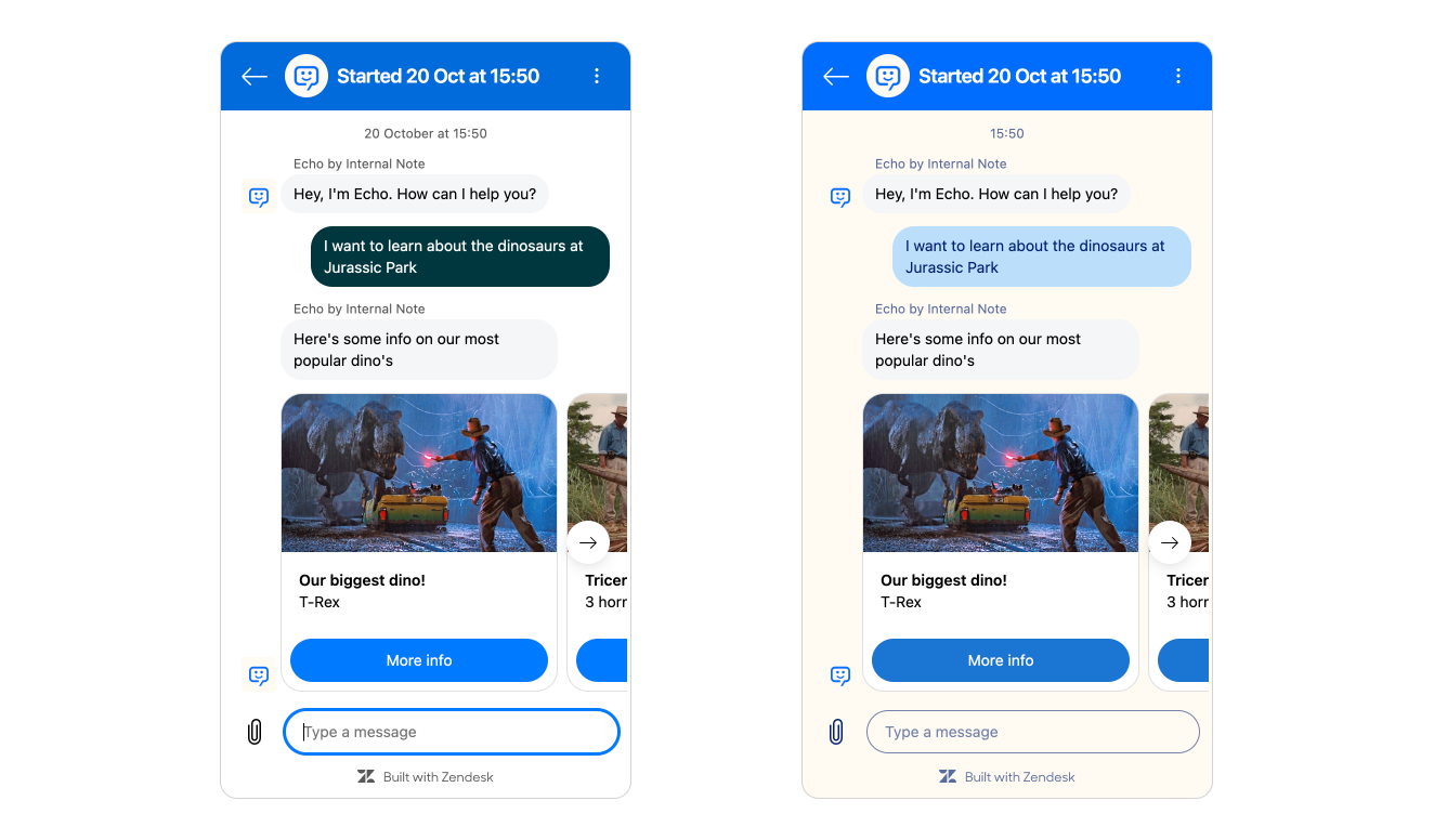
While your Help Center is important, more and more those interactions shift towards conversations with AI Agents and human agents via chat. Instead of leaving your website to search the Help Center, the Web Widget offers support right where the customer encounters their issue. Problems with the checkout page? There's an AI Agent ready to assist. Can't login? Well, there's that same widget to help you.
And just as with the Help Center, that support channel should reflect your brand. Your AI Agent has a name and personality. It might even have a cute custom icon. Mine's called Echo, and you can test him via the button bottom right!.
This article will focus on how you can make sure your web widget reflects your brand. Let’s start with what’s possible in the Admin Center.
Admin Center experience
Within the Zendesk Admin Center you can control some elements of the widget's look and feel. You can set a Primary color which colors the launcher button and the widget header. And you can set a message color and action color which defines how text balloons and buttons look. Combine this with a logo or AI Agent avatar and your web widget will look a lot more like your company's support channel than being a generic Zendesk widget.
There's scenarios where this styling is not enough though.
For one, your website might use your primary brand color in the footer, which can make you widget disappear. So you might want to switch to a secondary brand color on those pages.
Or you might have a single brand Zendesk but want to use the widget on to distinctly branded pages. You might be Microsoft, using blue, green, and red widgets for Word, Excel, and PowerPoint pages.

Or your site offers a dark mode, and you want the web widget to reflect that theming. (It’s curious why the widget doesn’t yet support dark mode natively.)
For these scenarios the brand options in Admin Center don't suffice. Adding a secondary brand to your Zendesk environment to handle that different theming is too complex a solution and should only be used for truly different department or brands.
So how do we solve these multi-brand, contextual theming challenges? The answer lies in taking control beyond the Admin Center interface—using code to customize the widget on a per-page basis. To understand what's now possible, it's worth looking at how we got here.
Custom Theming
Back when the Classic Zendesk widget and Zendesk Chat handled most conversations, a powerful customization API let you tailor nearly every aspect of the interface.
It offered a Javascript based API that allowed for client side customization of the web widget. You could change labels, colors, disable features, move the widget around, it truly offered a lot of possibilities.
That flexibility was powerful enough that I built the Widget Configurator—a Marketplace app providing a no-code UI for theming. You can still play around with a version of it, though it only works with the legacy widget. This tool showed how valuable visual customization could be when you didn't need a developer for every color change.
Then came the shift to Zendesk Messaging, and that customization capability disappeared. For years, teams wanting per-page theming or context-specific branding were stuck with the limited Admin Center options. And while I'm a big proponent of having powerful UIs to setup a platform instead of hiding customization behind code, the new Admin Center options are fairly limited as we noted earlier.
As Zendesk is moving more and more towards feature parity between Zendesk Messaging and Chat, that lack of customization was one of the final missing elements. But with the arrival of a new theming API for the Zendesk Web Widget, that's now a thing of the past.
Theming API
Similar to the original widget options, the new theming API lives as a Javascript function you can use client side to tweak the widget's design.
It calls a customization function that contains a theme payload that defines the colors used in the widget. In its most basic form it works like this:
zE('messenger:set', 'customization', theme);Compared to the Admin Center, we get a lot more control in this new API. We can set the header, message, action and background colors, as well as define the color of the text rendered on those elements.
Here's what it looks like:
zE("messenger:set", "customization", {
  theme: {
    primary: "#FE5E41",
    onPrimary: "#FFFFFF",
    message: "#F3C178",
    onMessage: "#5F0F00",
    action: "#B0DB43",
    onAction: "#000000",
    businessMessage: "#fff",
    onBusinessMessage: "#F10404",
    background: "#DFE0E2",
    onBackground: "#F10404",
    error: "#FF1744",
    onError: "#FFFFFF",
    notify: "#FF007F",
    onNotify: "#FFFFFF",
    onSecondaryAction: "#000000"
  }
})
That's a lot of properties to digest. The good news? You rarely need all of them. Let's look at how this works in practice.
When defining your theme, you don't need to specify all elements. Those omitted are rendered as default. This gives you flexibility to override only what matters for your brand.
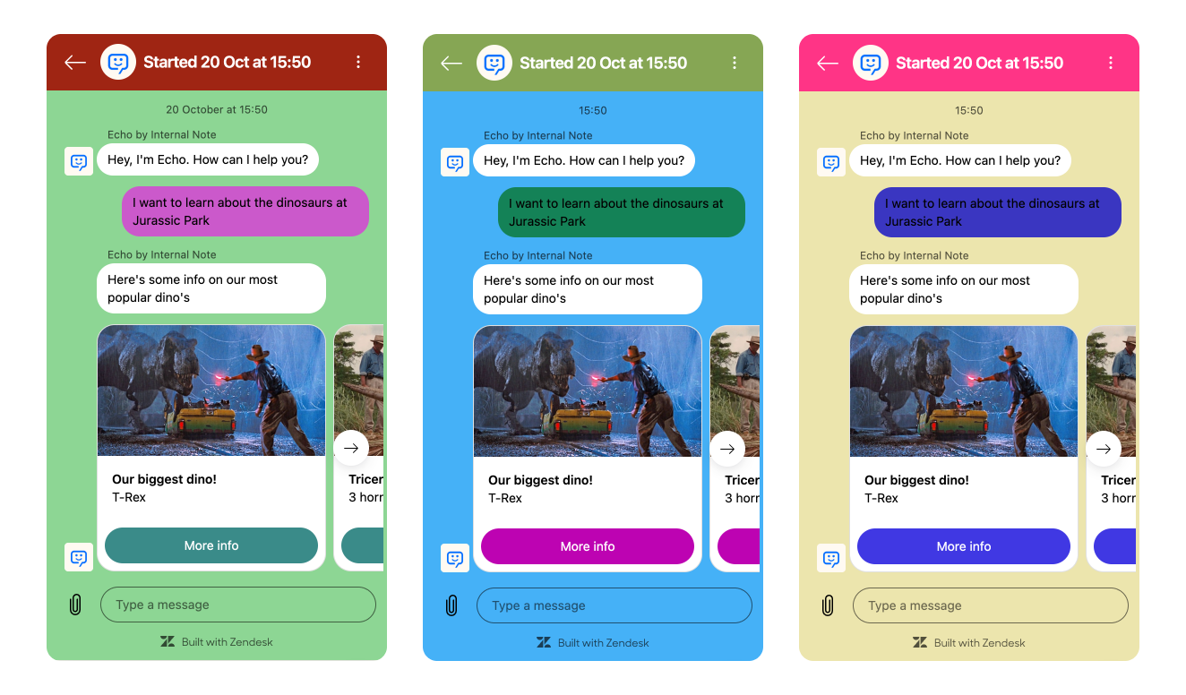
For example, below I created three widget themes offering red, green, and blue variations. Note how elements like the background and chat bubbles each contain subtitle variants of the themes' main color.
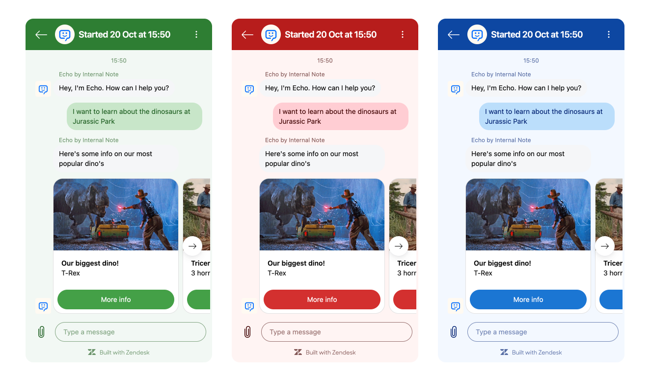
We can also use this to add a more nuanced branding to the widget, adding secondary, background and tertiary brand colors to the web widget:
Theme Builder
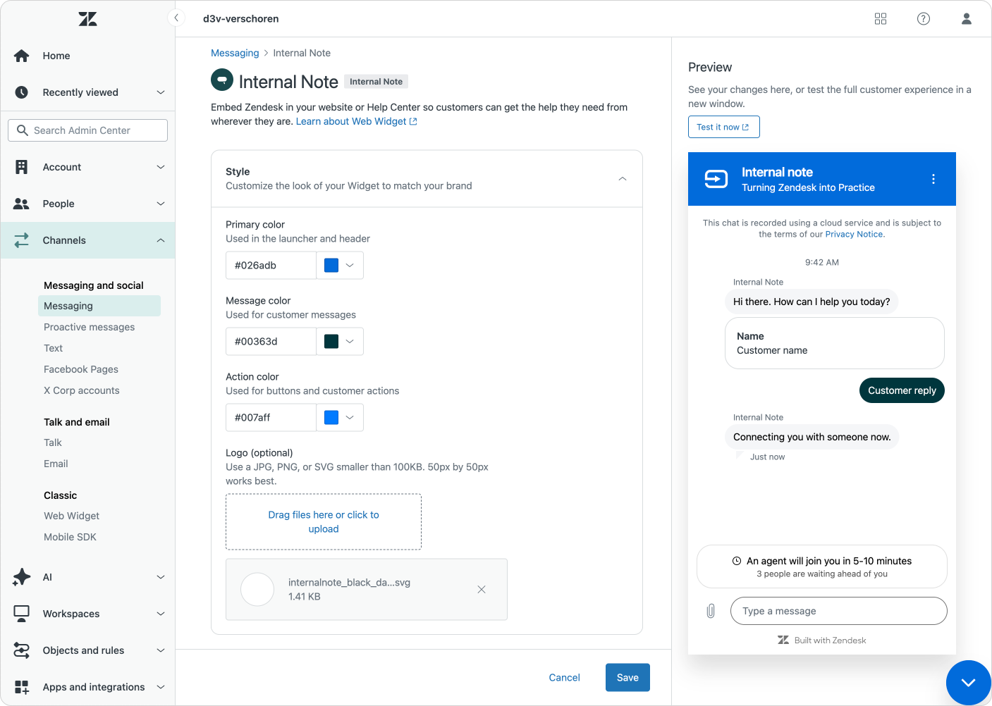
If you're not comfortable writing JavaScript or want to experiment with color combinations before committing to code, I've built a tool to help.
Drawing on my experience with the original Widget Configurator, I created a new version designed for the Messaging era. It lets you visually design your theme and generates the code for you. (And helped me generate the example themes used in this article)
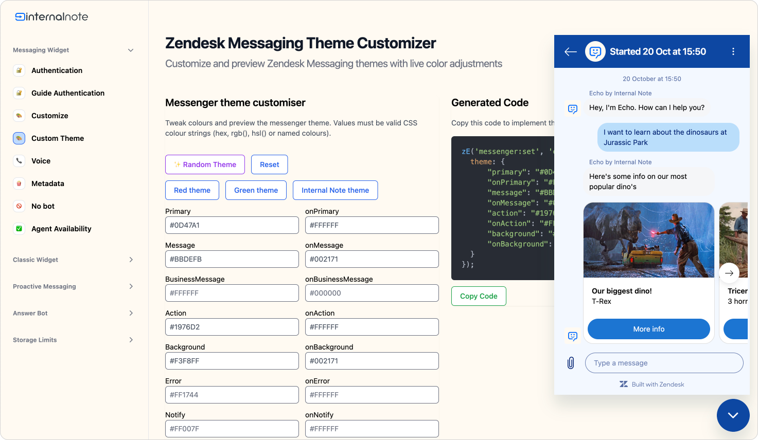
Try it yourself on the demo page below. This demo allows you to configure the web widget and tweak its design to your liking.
You can preview your colors in a real widget. Once you're happing, you can copy the rendered code to use on your own website.
Using these custom themes on your website is as easy as calling the zE('messenger:set', 'customization', theme); function after you initialize the web widget.
 Internal Note
Zendesk Widget Theme Generator
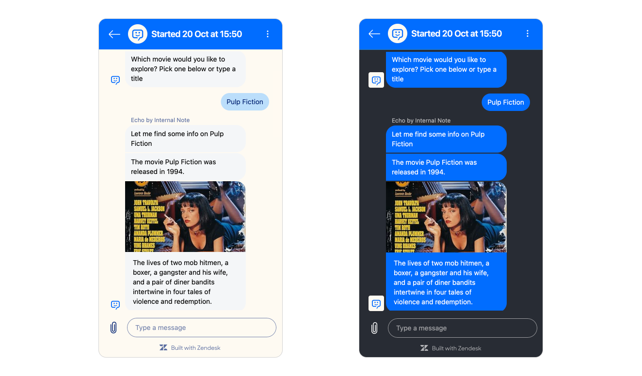
Dark Mode switcher
We can take this one step further and make the widget respond to the user's system theme. As more users embrace dark mode—especially in the evening—your widget can automatically adapt to match their preference and reduce eye strain.
This isn't just about aesthetics. A bright widget on a dark-themed site creates jarring contrast that can discourage users from engaging with support. Here's how to implement dynamic theming:
//Create two themes, where the lightTheme is your default branding, and darkMode reflects a darker version of your brand
lightTheme = {
  theme: {
    background: "#FFF",
    onBackground: "#000"
    //add other colors
  }
}

darkTheme = {
  theme: {
    background: "#000",
    onBackground: "#FFF"
    //add other colors
  }
}

// Check if dark mode is currently enabled, reflect the current state on page load and listen for changes
const darkModeMediaQuery = window.matchMedia('(prefers-color-scheme: dark)');
handleDarkModeChange(darkModeMediaQuery);
darkModeMediaQuery.addEventListener('change', handleDarkModeChange);


// Function to handle dark mode changes
function handleDarkModeChange(e) {
  if (e.matches) { //Dark Mode is active
    zE('messenger:set', 'customization', darkTheme);
  } else { //Use Light Mode
    zE('messenger:set', 'customization', lightTheme);
  }
}
The result is seamless: your widget automatically switches themes based on the user's system preferences, maintaining visual consistency with both your site and their device settings.
Conclusion
So that's Zendesk Widget customization and the new theme API. It allows for fully customizable themes and coloring of the web widget on your website.
Compared with the classic web widget, some items are still missing. We still can't change text, tweak header titles and descriptions, or reposition the widget—features that would make branding even more flexible and contextual.
Other useful additions would include tweaking AI Agent avatars and names, disabling multiple conversations, hiding the attachment button, or adjusting corner rounding. These capabilities would help the widget fit both your branding and the specific needs of each page context.
Positioning controls remain absent too, which matters when working around cookie banners or marketing CTAs. Custom radius options would ensure the widget matches unique designs across different subpages.
But as always, I'm happy with the options we got today, and while there's always more to tweak, these newest API's open up a lot more capabilities for making Zendesk fit your branding.
Just be aware.
“With great power comes great responsibility—so please, resist the urge to make your widget neon pink.”