
Customize and brand your Classic Zendesk Widget
Zendesk has a nice Web Widget to embed your contact channels and FAQ on any page of your website creating a consistent experience that aligns with your brand.

Customize and brand your Classic Zendesk Widget
Zendesk has a nice Web Widget to embed your contact channels and FAQ on any page of your website creating a consistent experience that aligns with your brand.

On this page
Zendesk has a nice Web Widget that allows you to embed your contact channels and FAQ on any website. This allows your customers to have the same experience when they contact you via your website, web shop or FAQ and makes your Help Center content available anywhere on your website.
Questions about compatibility while looking at a product on your website? The FAQ search in the Widget has got you covered. Urgent questions about an expired promo codes while checking out? Live Chat's just a click away.
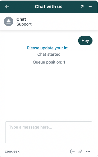
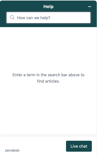
The widget can be embedded on any website, and Zendesk offers a native customisation to tweak the Widget's primary color so it aligns to your branding.
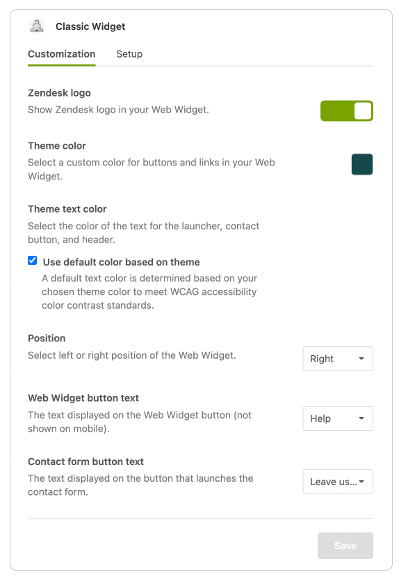
But what if we take it one step further? Completely customise the Widget's branding with custom colours, logos and titles?
This not only differentiates your Support offering from any other Zendesk customer, it also allows you to add some personality to your Customer Care with custom colours, logos and naming conventions.
Note, this guide applies to the Classic Zendesk Widget.Zendesk Messaging currently only offers a limited set of options via the Admin Panel.
How does it work?
Customising the widget requires adding some extra Javascript code on your website just below the embed code Zendesk provides.
See example here:

Colors
You can overwrite the default color and assign custom colours to a couple of elements:
window.zESettings = {
    "webWidget": {
        "color": {
            "theme": "#007aff",
            "launcher": "#FFCC00",
            "launcherText": "#142b39",
            "button": "#007AFF",
            "resultLists": "#007AFF",
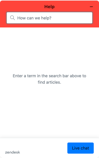
            "header": "#FF443A",
            "articleLinks": "#007AFF"
        }
    }
}- Theme: the primary color set by the Widget Settings
- Launcher and Launcher Text: the color of the button and its text specifically.
- Button: Any button in the Widget UI
- Result List: color of search results from the Guide search
- Header: Color of the Widget's header
- Article Links: Color of links in text.
Launcher
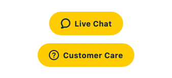
By default the widget has Support or Live Chat as labels for the Widget for when chat is respectively offline and online.
You can override this text to have a specific call to action:
window.zESettings = {
    "webWidget" : {
        "launcher": {
            "label": {
                "*": "Customer Care"
            },
            "talkLabel": {
                "*": "Call Us"
            },
            "chatLabel": {
                "*": "Live Chat"
            }
        }
    }
}
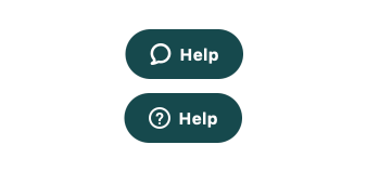
Putting it all together creates a redesigned widget like this:
Answer Bot and Chat
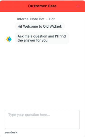
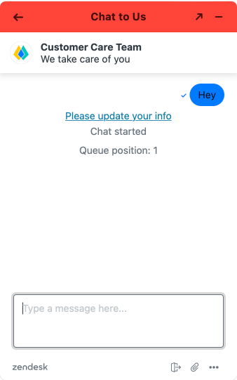
Going one step further we can also tweak the design of your Answer Bot and Chat Agents:
- Answer Bot allows for a custom Avatar, name and title.
- Chat allows a custom Avatar, title and subtitle.
window.zESettings = {
	"webWidget": {
		"answerBot": {
			"avatar": {
				"url": "https://website.com/avatar.png",
				"name": {
					"*": "Internal Note Bot"
				}
			},
			"title": {
				"*": "Customer Care"
			}
		},
		"chat": {
			"concierge": {
				"avatarPath": "https://website.com/avatar.png",
				"name": "Customer Care Team",
				"title": {
					"*": "We take care of you"
				}
			},
			"title": {
				"*": "Chat to Us"
			}
		}
	}
}
Note that the title and name can be Locale aware by specifying more locales:
...
"name": {
    "*": "Our Support Bot",
    "nl": "Onze Hulp Bot",
    "fr: "Notre Bot D'Aide"
}
...
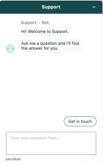
The result

Putting all the code together:
window.zESettings = {
  "webWidget": {
    "contactOptions": {
        "enabled": true
    },
    "color": {
      "theme": "#007aff",
      "launcher": "#FFCC00",
      "launcherText": "#142b39",
      "button": "#007AFF",
      "resultLists": "#007AFF",
      "header": "#FF443A",
      "articleLinks": "#007AFF"
    },
    "answerBot": {
      "avatar": {
        "url": "[email protected]",
        "name": {"*": "Internal Note Bot"}
      },
      "title": {
        "*": "Customer Care"
      }
    },
    "chat": {
      "concierge": {
          "avatarPath": "[email protected]",
          "name": "Customer Care Team",
          "title": {"*": "We take care of you"}
      },
      "title": {
          "*": "Chat to Us"
      }
    },
    "launcher": {
      "label": {
          "*": "Customer Care"
      },
      "talkLabel": {
          "*": "Call Us"
      },
      "chatLabel": {
          "*": "Live Chat"
      }
    }
  }
}
Further reading
The Zendesk Widget offers a whole lot more customisation options, going from showing/hiding parts of the UI, changing label text, filtering search results e.a.
Check out the API or the awesome Widget Guide I build for Premium Plus.


