
Preview of the new cards for Custom Objects
Zendesk’s new Essentials Card lets you customize user profiles next to tickets, and now, Custom Object Cards do the same. You can reorder, hide, or add fields to streamline your agents’ view. A simple yet customizable update to enhance the agent experience.

On this page
Last summer Zendesk released the new Essentials Card for user profiles. It allows you to customize the data shown for a requester next to a ticket. You can hide user fields and reorder them to fit your needs.
 Thomas Verschoren
Similar to user profiles, Zendesk has another type of data that can be shown next to tickets and that's Custom Objects. When you link a Custom Object to a ticket via a Lookup Field, you can use the record inspector to show its data next to the ticket conversation.
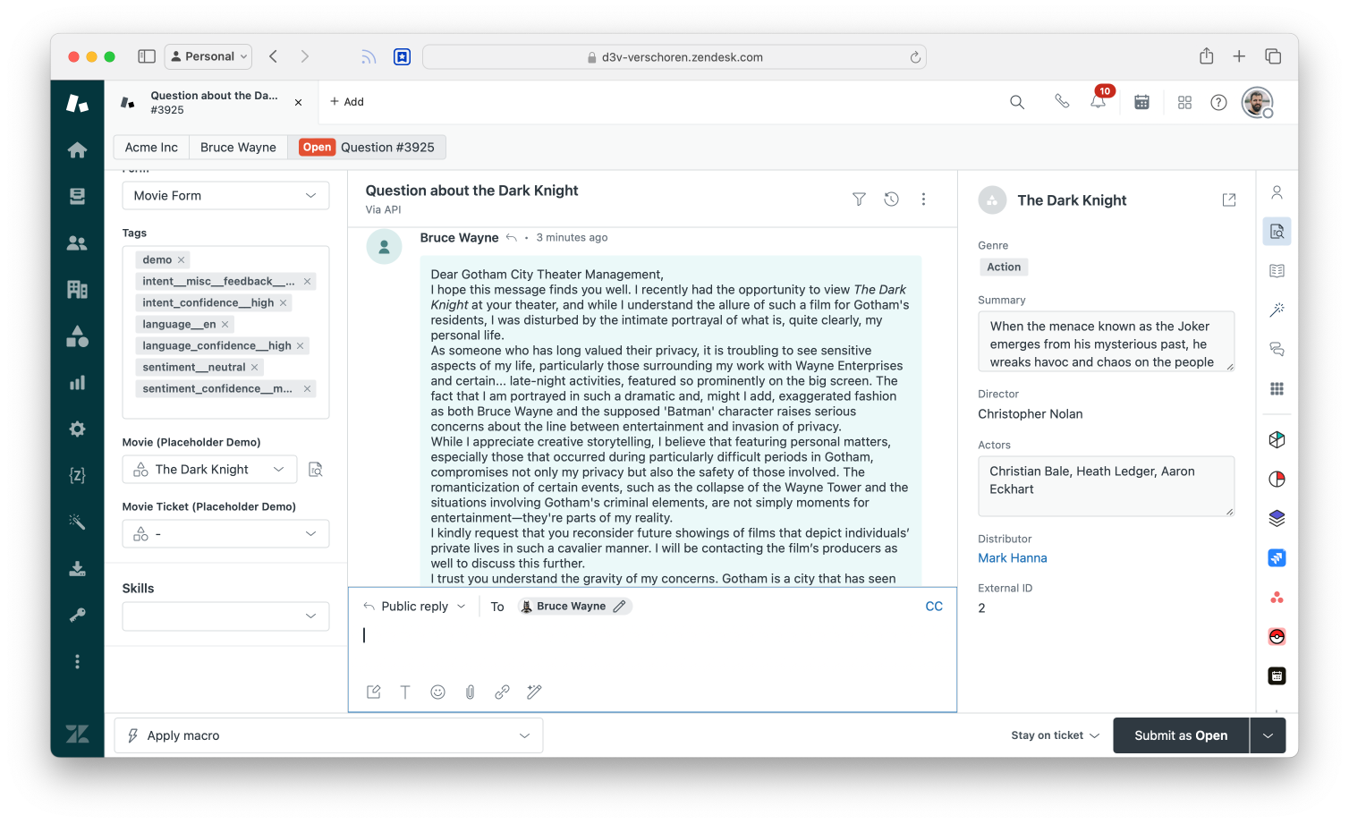
Up to now you couldn't modify this view. Fields were shown in the order they were added in the Admin Panel when you configure the object, and you can't hide fields to be shown.
In the screenshot above for example fields like Distributor and External ID are useful for some flows like Custom Object Triggers but not relevant for my agents.
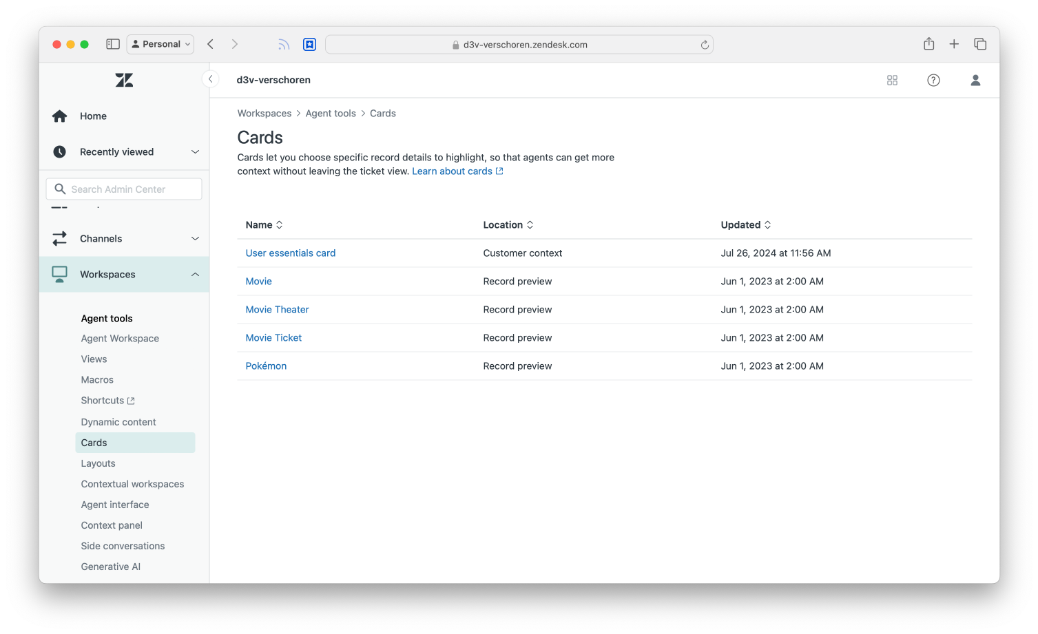
Custom Object Cards
Enter Custom Object Cards. Similar to how the User Essentials Card allows you to modify what's shown, we can dive into Admin Center > Workspaces > Cards and select a Custom Object type from the list.
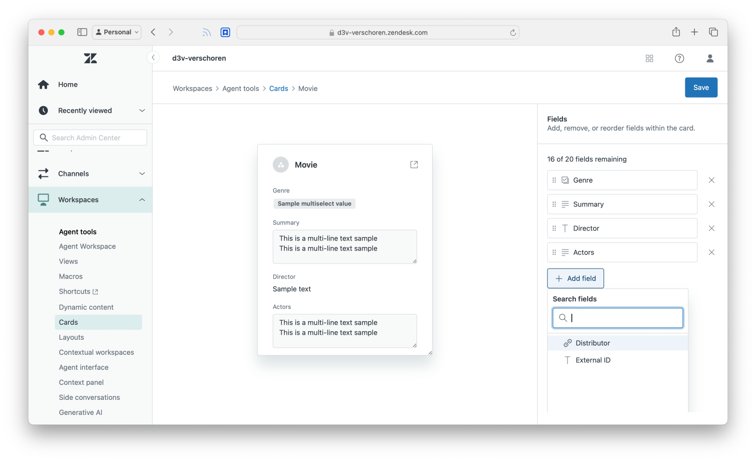
Once selected, you can use the rightmost panel to reorder your record fields by dragging them to a new position. You can use the X to remove them from your Agents' view, and similarly you can use the Add Field button to add a previously hidden field.
Agent Experience
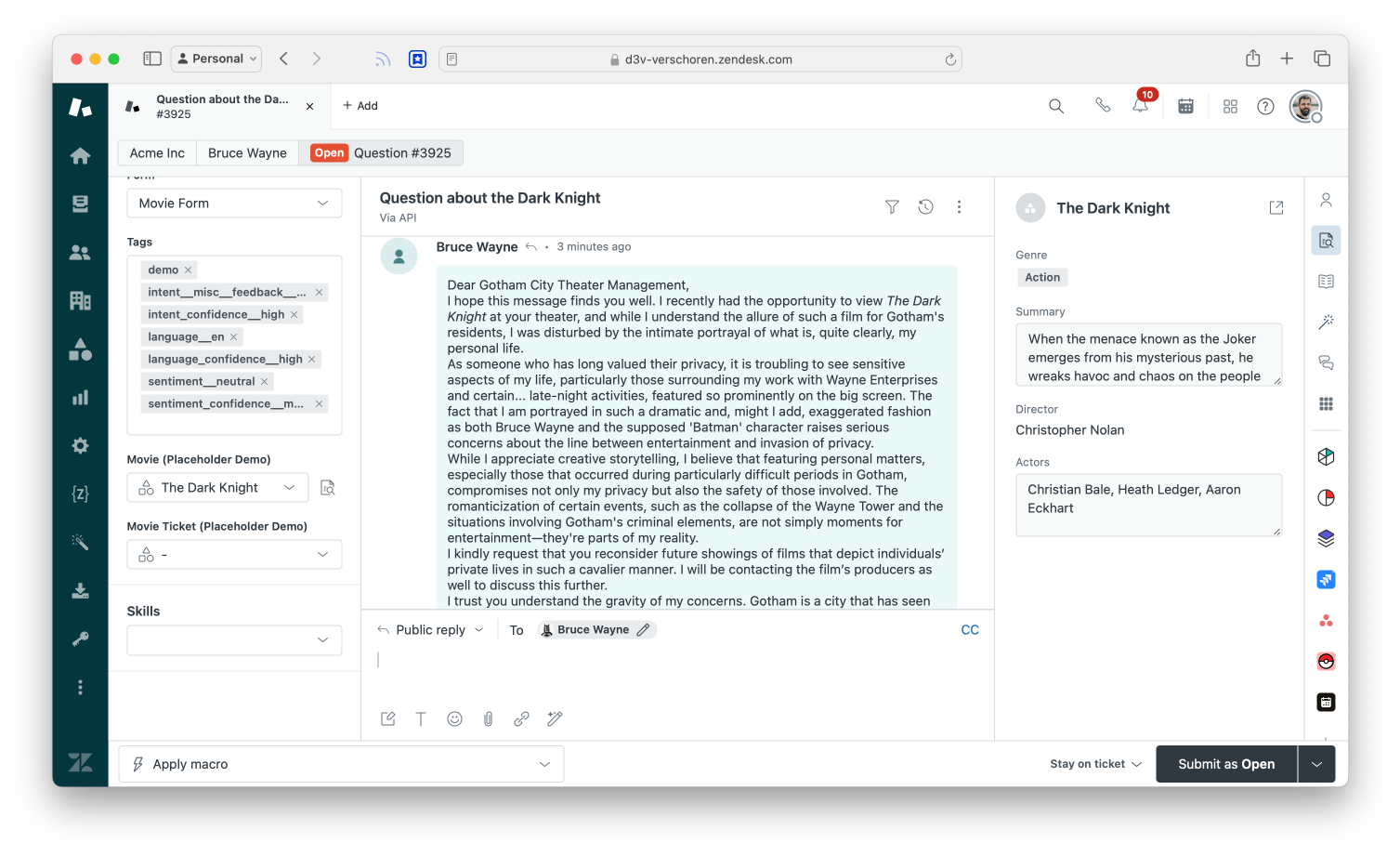
After customizing the Card, your agents will see the new layout appear the next time they open a ticket:
Conclusion
The new Cards for Custom Objects are a nice MVP but I'd love the Record Inspector to show a richer experience than the current plain layout.
Why can't we add some color to the mix and e.g. highlight the Action genre in the screenshot above with a green color? Summary could be nicer text than the grey text box, and a bit more visual hierarchy would be a nice to have too.
But aside from those wishlist items — and admit it, everyone has some – I like the way the Agent Workspace gets more customizable month after month.