Embedded mode for the Zendesk Widget
Embeddable mode transforms the Zendesk Widget from a fixed overlay into a flexible, fully integrated component. You can embed it anywhere, split it into separate components, customise its UI, trigger conversations programmatically, and match it to your product’s layout and design.

On this page
Customers and employees can reach you through every possible channel: email, social messaging, forms, and embedded conversations with your AI Agents. These entry points give people flexibility, but they rarely behave as first-class parts of your product. Most of them sit on top of your website or application rather than fitting naturally inside it.
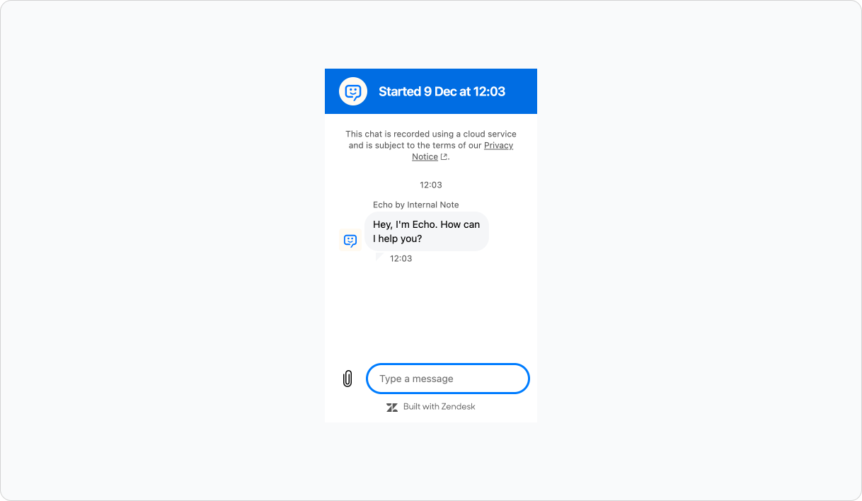
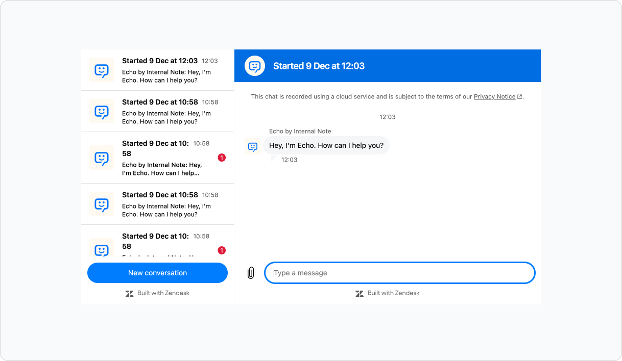
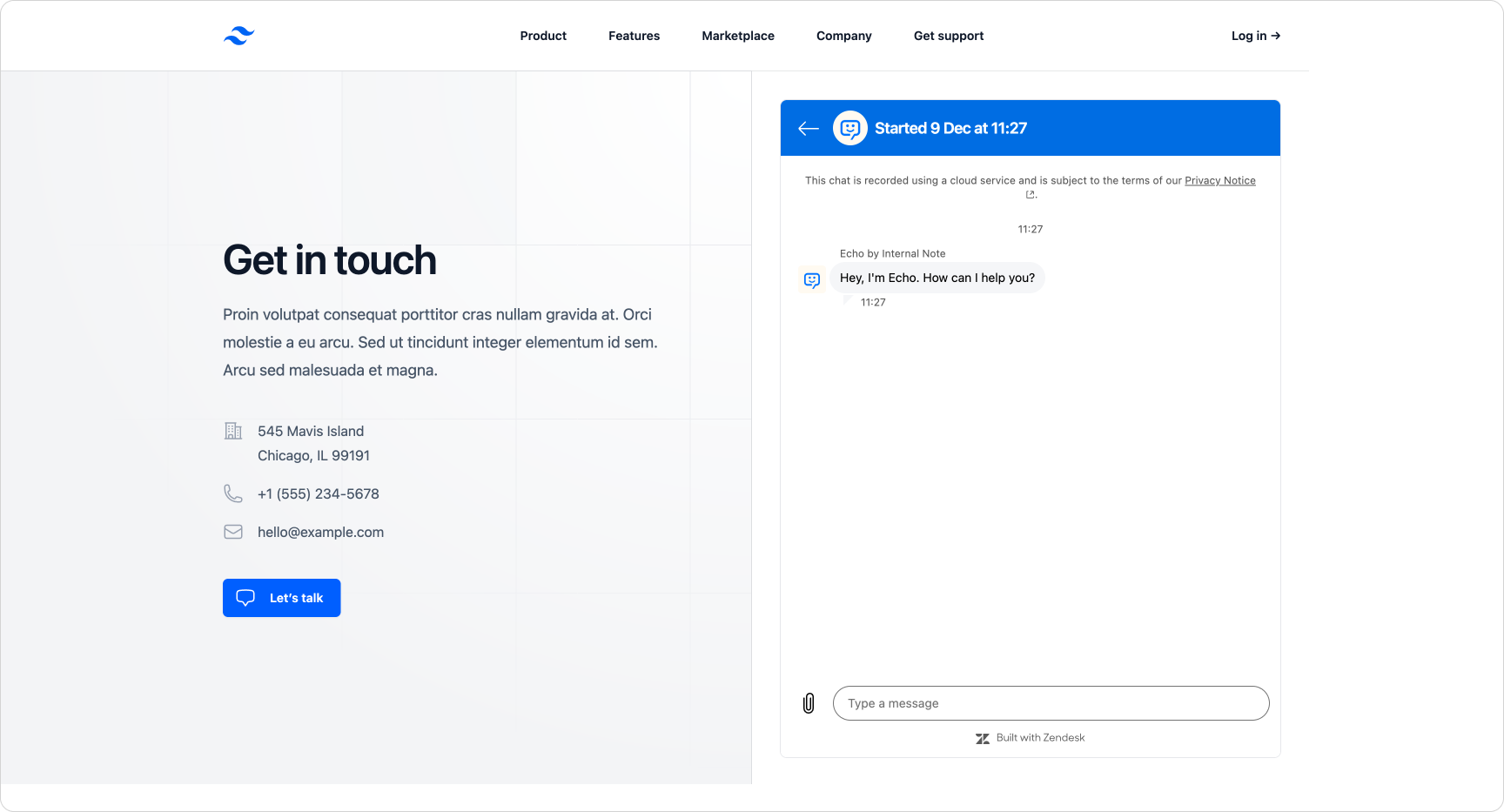
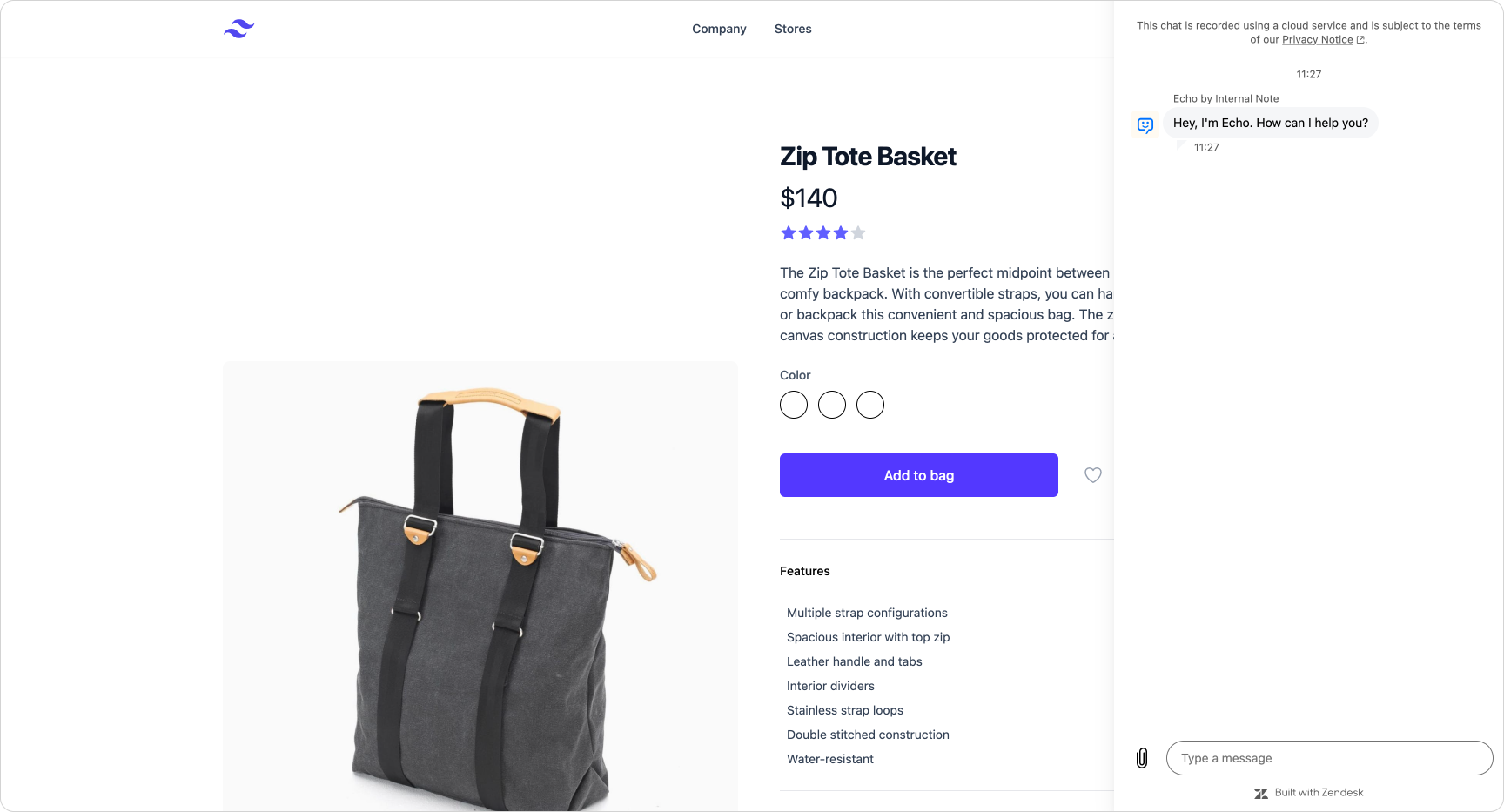
The Zendesk web widget is a good example. It appears as a floating button, expands into a fixed box, and always sits on top of your content. That works for simple sites, but not for product teams building dashboards, portals, or full SaaS applications where support should feel integrated rather than bolted on.
Maybe you need your support pane to slot into a multi-column layout. Maybe you want it to behave like a native part of your UI, the way webmail or admin panels handle conversations. Or perhaps you simply want customers to move the widget so it never covers critical content.
Until now, this wasn’t possible. The Zendesk widget offered only limited control over size, placement and structure. But thanks to the new embedded mode, things are changing!
Customising the Zendesk widget (what’s possible today)
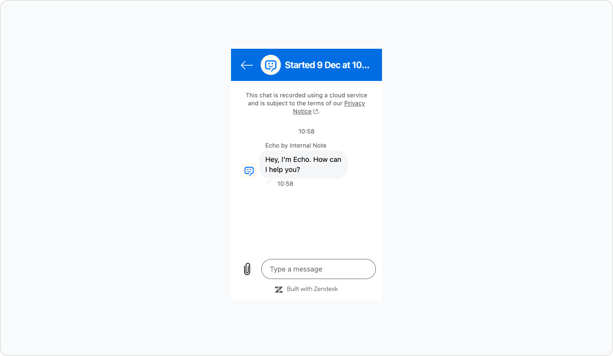
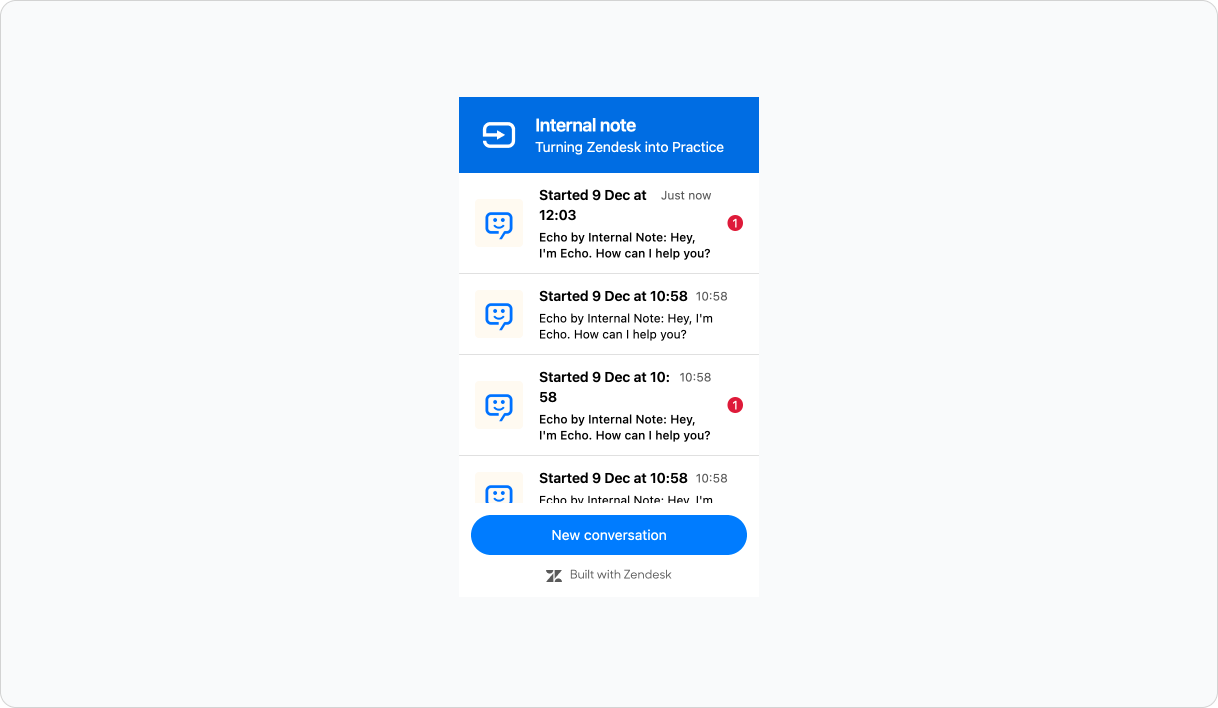
Before we look at embedded mode, it’s useful to recap what the Zendesk Messaging Widget already allows you to customise. Today, you can set a fixed left or right position, apply offsets to avoid elements such as cookie banners, and adjust colours through Admin Center or the theming API. These options are helpful for basic branding and for making the widget play nicely with simple layouts.
 Thomas Verschoren
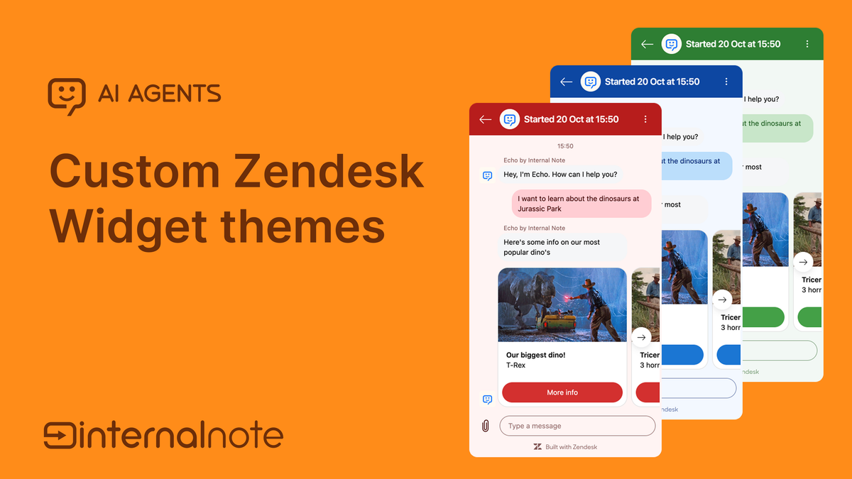
But they also show the limits. You cannot resize the widget, centre it on the page, remove structural elements such as the header or conversation list, or make it behave like a native part of a more complex interface. For most teams, the widget still sits on top of the product rather than inside it.
Zendesk used to offer deeper flexibility with the SunCo Web Widget, which supported richer embedding and layout control, but that widget is now in maintenance mode. Until now, the main widget did not offer comparable control.
The new embedded mode
embedded mode is a new way to load the Zendesk Messaging Widget, one that removes the fixed floating box entirely. Instead of rendering the widget as an overlay in a predetermined position, you tell it to render inside an element you control. The widget will automatically fill that element’s width and height, which means you can place it anywhere on your site or application and size it however you like.
In practice, this turns the widget from a static UI into a flexible component. It can sit inside a column layout, replace part of a dashboard, slot into a box on a portal page, or behave like a native panel within a SaaS interface.
To use embedded mode, you first disable the default auto-render:
window.zEMessenger = {
  autorender: false
}
Then you specify where it should appear by clarifying an element's id or class.
zE('messenger', 'render', {
  mode: 'embedded',
  widget: {
    targetElement: '#messaging-container'
  }
});
The widget now renders inside #messaging-container, adopting the size and position defined by your own CSS rather than enforcing its own.
Composable subviews
Embedded mode also introduces a powerful extension: composable subviews. Instead of embedding the full widget, you can render the conversation list and message log as separate elements. This lets you integrate conversations directly into your product UI—sidebars, main sections, tabs, or any layout you prefer.
Example: conversation list only:
zE('messenger', 'render', {
  mode: 'embedded',
  conversationList: {
    targetElement: '#conversations-container'
  }
});
Example: active conversation only:
zE('messenger', 'render', {
  mode: 'embedded',
  messageLog: {
    targetElement: '#messages-container'
  }
});
Most use cases benefit from rendering both components. This gives you full control over placement, proportions and responsiveness, allowing support conversations to match the structure of your application rather than interrupt it.
zE('messenger', 'render', {
  mode: 'embedded',
  conversationList: {
    targetElement: '#left-sidebar',
  },
  messageLog: {
    targetElement: '#main-content',
  },
});
Once split, each component can be positioned, sized, or styled independently using your own CSS. A two-column layout, a collapsible sidebar, a full-page support view—anything your product design requires is now possible.
New theming options
When you embed these components inside an existing interface, some of the widget’s native UI can feel redundant. Headers, icons, or the new-conversation button may clash with your own layout or design language.
The new API lets you hide these elements at a granular level:
zE('messenger:set', 'customization', {
  common: {
    hideHeader: false,
    contentScale: 100
  },
  conversationList: {
    hideHeader: true,
    hideNewConversationButton: true
  },
  messageLog: {
    hideHeader: true
  }
})
Two options are especially useful. hideNewConversationButton hides the New Conversation button and allows you to add your own somewhere in your interface.
And contentScale adjusts text and icon size from 50–200%, helping the widget blend seamlessly with your typography and spacing.
These settings effectively let you strip the widget back to its functional core, while designing the surrounding UI entirely on your terms.

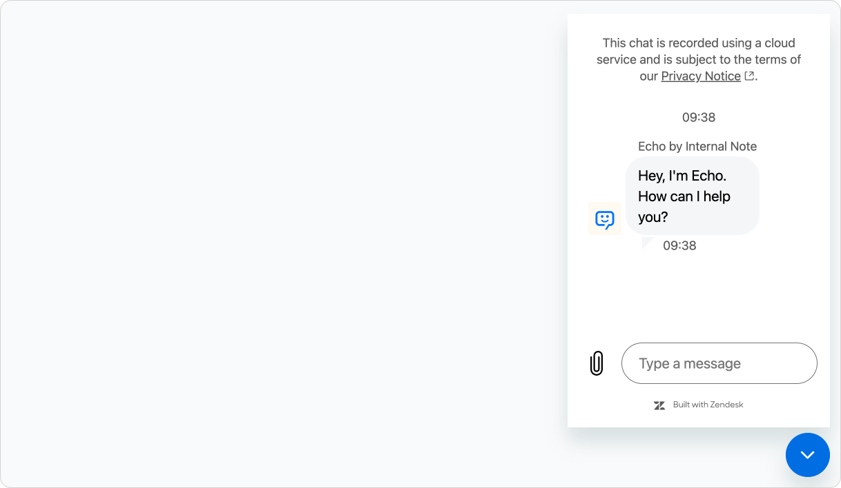
floating mode. You can still hide the header, remove the new conversation button and scale its content.Starting conversations programmatically
Once you hide the widget’s native “new conversation” button, you need another way for customers to start a thread. Embedded mode introduces exactly that: a method for triggering new conversations from your own UI elements.
The simplest form creates a new conversation instantly:
webWidget('messenger:ui', 'newConversation');You can also customise the action with optional metadata, allowing your application to pass context directly into Zendesk:
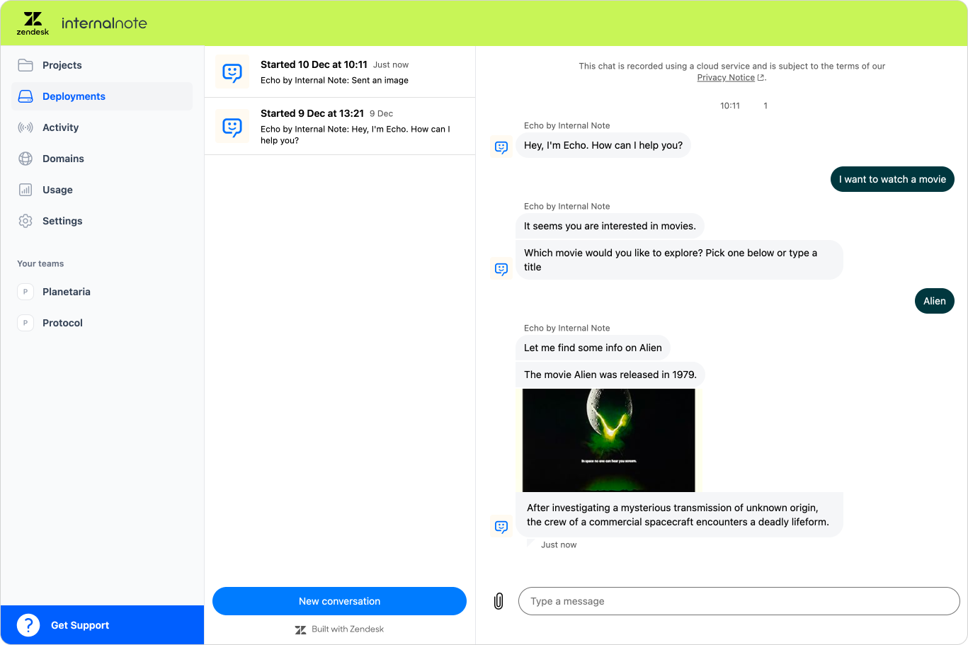
zE('messenger:ui', 'newConversation', {
  displayName: 'Request Movie Info',
  iconUrl: 'https://internalnote.com/echo.png',
  metadata: {
    source: window.location,
    movie: 'Blade Runner',
    userId: 42
  }
});
This makes it possible to replace the widget’s built-in UI with your own button, link, menu item, or command palette—whatever fits your interface. In design terms, you’re no longer rearranging a fixed widget: you’re integrating messaging as a native feature of your product.
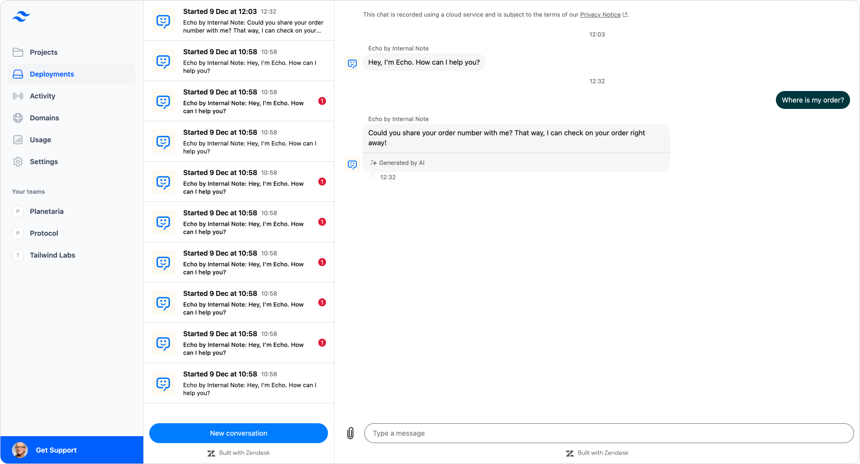
Do note, in the new embedded mode this API only works if the widget has at least one initial conversation since we need an active AppUserId that defines the current user, and the widget needs to by fully loaded when doing so.
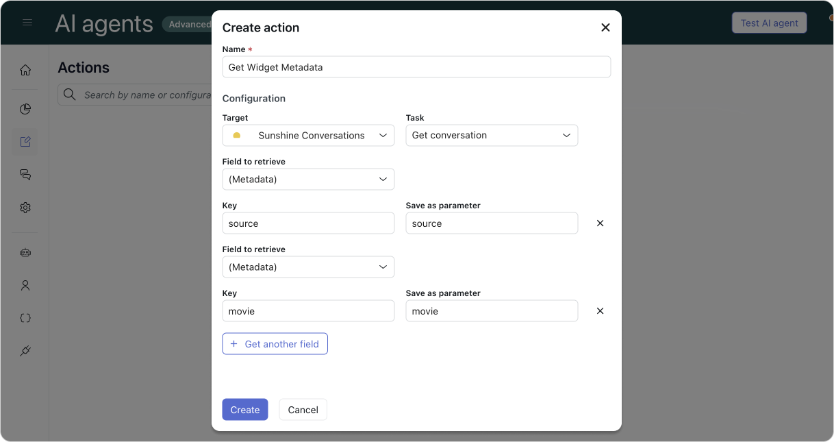
The metadata we can pass this way has actual benefits when combining them with AI Agents Advanced. Any metadata elements we pass are stored in the conversation as such:
{
    "conversation": {
        "metadata": {
            "source": "https://internalnote.com/archive",
            "movie": "Blade Runner"
        }
        //...
    }
}
And can be retrieved in AI Agent actions to use as parameters in your dialogue flows or procedures:
Full overview
Bringing all of these capabilities together, embedded mode turns the Zendesk Messaging Widget into a fully flexible component system. You can now:
- Embed conversations directly inside your layout
Render the conversation list and message log as separate components, and position them anywhere in your UI. - Control size and placement entirely through your own CSS
Place the widget in a sidebar, a main content area, a modal, a drawer, or any custom container. - Remove native UI elements
Hide headers, remove the new-conversation button, and rely on your own structural components. - Adjust typography and scale
UsecontentScaleto match the widget to your product’s type system and spacing. - Start conversations from your own UI
Trigger new threads programmatically, with metadata that gives your agents immediate context.
Here is a combined example showing these elements in practice. This example shows the widget split into two components, styled to fit a custom theme, with the native “new conversation” button disabled and replaced by a programme-triggered alternative.
zE('messenger', 'render', {
  mode: 'embedded',
  conversationList: {
    targetElement: '#conversation-sidebar',
  },
  messageLog: {
    targetElement: '#messages-sidebar',
  },
});

zE('messenger:set', 'customization', {
    common: {
      hideHeader: false
    },
    conversationList: {
      hideHeader: false,
      hideNewConversationButton: true
    },
    messageLog: {
      hideHeader: true
    },
    theme: {
        primary: "#D1F470",
        onPrimary: "#11110D",
        message: "#FEEB7E",
        onMessage: "#11110D",
        action: "#B0DB43",
        onAction: "#11110D",
        businessMessage: "#A1D78F",
        onBusinessMessage: "#11110D",
        background: "#F5F5F2",
        onBackground: "#11110D",
        error: "#FF1744",
        onError: "#FFFFFF",
        notify: "#FF007F",
        onNotify: "#FFFFFF",
        onSecondaryAction: "#000000"
    }
});

zE('messenger:ui', 'newConversation', {
  displayName: 'Request Movie Info',
  iconUrl: 'https://internalnote.com/echo.png',
  metadata: {
    "source": "https://internalnote.com/archive",
    "movie": "Blade Runner"
  },
});
A few limitations
Embedded mode is a major upgrade, but it still comes with a few constraints to keep in mind:
- No click-through from conversation list to message log
If you only render the conversation list, there is currently no event that lets you detect when a customer selects a conversation and then load the message log yourself. To support navigation, you should embed both components. - Removing headers removes some native features
Header actions such as navigation from a conversation back to the main list, or transferring an ongoing conversation to connected social channels are not available when the header is hidden. - Proactive messages are not supported in embedded mode
Proactive message delivery requires the floating widget. Embedded mode does not yet surface those messages. - Unread messages only register after render
The Unread Messages API becomes active only once a widget component has been rendered on the page. - newConversation() has an initialisation dependency
As noted earlier, the programme-triggerednewConversation()function only works in embedded mode if at least one conversation already exists for the visitor. This is a temporary limitation and will be addressed in a future update.
Embedded the widget in some actual websites.
Now that we understand how embedded mode works, we can look at how it behaves in practice. The demo site below shows several real implementations—from simple embeds to full product-style layouts. You can explore each example and inspect the underlying code to see how it was achieved.
 Internal Note
Simple embed
In these examples, the full widget is rendered inside a container element, and its placement and size are controlled entirely through your CSS. This makes it easy to:
- show or hide the widget when a user clicks a button
- anchor it to a fixed area of the page
- create slide-in panels or drawers
- blend the widget into existing content rather than overlaying it
The slide-over demo hides the native header for a cleaner look, while the side-by-side view simply renders the full widget as-is within a flexible layout.
Column based layout
Here, the widget is split into components and embedded as part of a two-column design. The conversation list occupies a narrower sidebar, while the active conversation takes centre stage. By hiding the headers, the interface feels more like a natural part of the product.
If desired, you could remove the native “new conversation” button entirely and add your own controls to a custom header that spans both columns.
Single conversation embed
This version embeds only the active conversation in a landing page or employee portal. Instead of listing past threads, the user drops straight into a conversation with your AI Agent—ideal for guided help flows or onboarding experiences.
A custom “New chat” button can be added to let employees reset the session and start a fresh conversation.

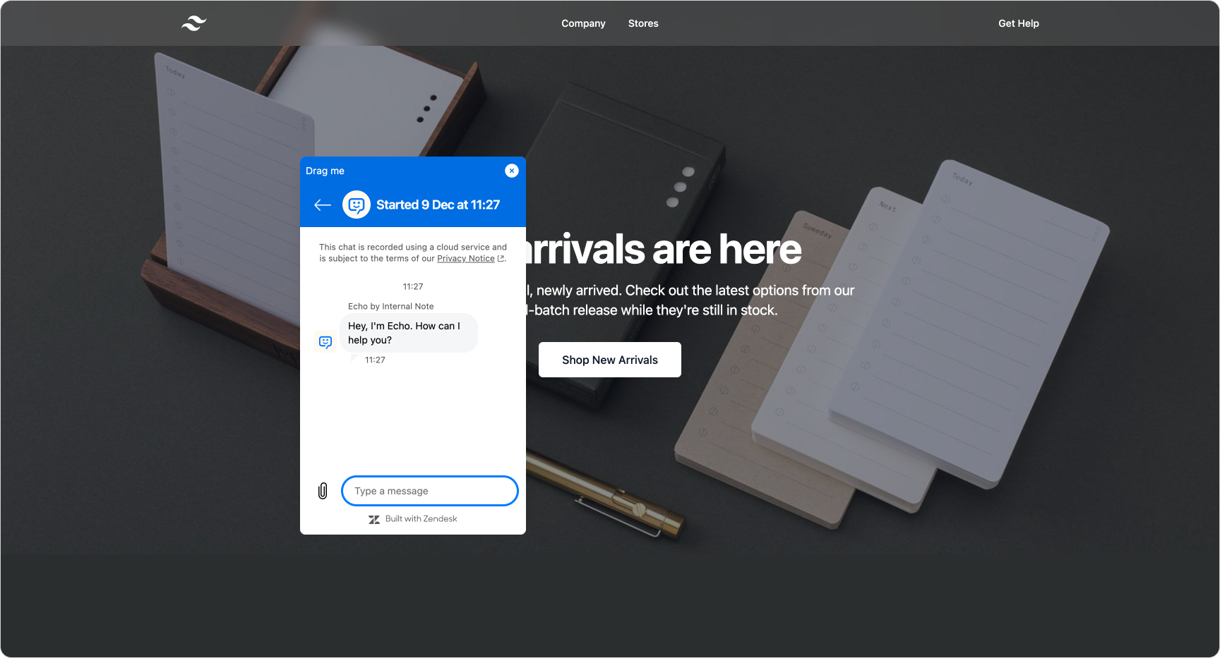
Draggable
This proof of concept shows that once the widget becomes a component, you can attach additional behaviours. In this case, the widget can be dragged freely across the page, letting the customer reposition it without covering important content.
Help Center
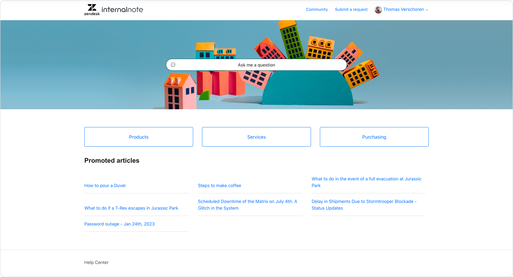
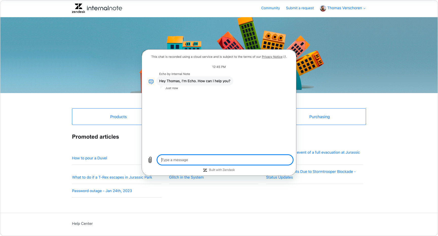
A more experimental idea: embedding the widget inside a Help Center page to replace the traditional search-and-result pattern. Instead of scanning articles or receiving a brief Quick Answer, customers can talk directly to your AI Agent within the page and resolve their question through a conversation.
Rich widget layout
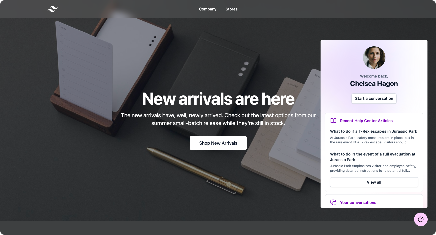
And a final wildcard option, a fully custom widget experience that shows a personalised welcome to the user, a list of recently updated articles on the Help Center and an inline conversation history.
To be clear, the entire experience you're seeing here is custom code, with only the conversation list part of the new embeddable experience. I build this example to show that, with this new mode, the sky really is the limit for those that want to dive into code.
Conclusion
Embedded mode turns the Zendesk Messaging Widget into a true building block for your website or application. Instead of a fixed overlay, it becomes a flexible component that can sit inside dashboards, portals, landing pages or product interfaces. It can be scaled, positioned and styled entirely on your terms.
You keep the benefits of Zendesk’s AI Agents, messaging infrastructure and conversation history, but gain the freedom to make support feel native to your experience rather than added on top of it.
For teams who want deeper integration, tighter branding and more control over the customer journey, embedded mode opens a level of customisation that simply wasn’t possible before. It is a significant step toward making support an integrated part of your product, wherever your users need it.